Ami
Year
Role
Discipline
Credits
2022
Brand Design Lead
Brand Identity · Design System · Art Direction · Web
---
Background
Ami is a mental wellness coaching platform, aimed at demystifying and destigmatizing the mental health space for a new generation of employees in the APAC region. They offer instant, accessible, and adaptive healthcare support through corporate benefits packages, and using a proprietary matching algorithm (think dating app but for coaching) Ami is able to match new users and begin a session with one of their highly vetted wellness coaches in less than a minute. Their hope is with unlimited, anytime access to coaching, personalized plans for short and long-term growth, and a focus on self-cultivation will help combat burnout and cultivate a healthier work environment.
The Challenge
Develop an approachable mental wellness brand for a new generation of employees experiencing workplace burnout in the APAC region. An effective solution will be cognizant of, but not limited by the generational stigma surrounding mental health, and break through the wall of sterility and sameness that currently occupies the space.
The Execution
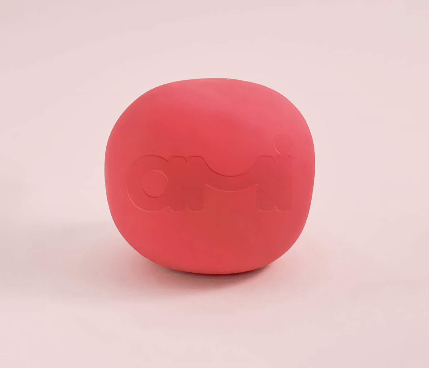
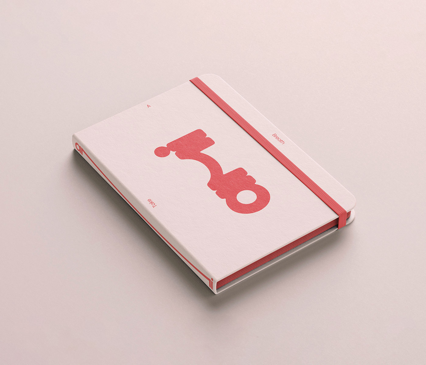
I had two main sources of inspiration for the Ami brand, and both were rooted in coping mechanisms for stresses and anxieties in the workplace. The first was a skill I learned from my own stress management, the 4-7-8 breathing technique. It involves taking a deep breath in for 4 seconds, holding for 7, and exhaling for 8, and can help manage anxiety in high stress situations. I wanted the wordmark to be a literal representation of this stress management technique, inflating and deflating like lungs using the same breath pattern. My hope is that the mark in motion provides a calming effect.
This leads me to my second source of inspiration, human connection. This should come as no surprise given the last few years, but during my research I found countless articles citing that workplace burnout is at an all-time high in the Pan-Asian region due to the onset of the pandemic and the subsequent shift to a work-from-home environment. Employees are experiencing an erosion of barriers between work and life, and reporting extremely strong feelings of isolation. The cure for that experience of isolation: real human connection. I use the Ami logo's "m" form to tell that story. A variable letterform comprised of two stems and a shoulder, that stretches but never breaks, representing an ever-present support system or lifeline in your Ami coach.
These two ideas combined to create a variable, and flowing wordmark that almost feels alive. Its flexibility also provides the base for other foundational brand elements like a framing device for ad units.
Themes
The Ami team has a clear point of view on mental health: it’s okay to not be okay. There’s no obligation to be happy - only an obligation to be working towards a healthier you. Communication of that message becomes difficult though when you're dealing with a culture of implicit stigma. This led me to the development of three major themes for photography and tone - Wellness, Burnout, and Disconnection - which will communicate differently to employees based on how receptive they are to the idea of wellness coaching.
Wellness is the most straight-forward. See wellness, want wellness. It leans into the aspirational - seeing that light at the end of the tunnel through candid, vulnerable moments of others experiencing strength and joy.
Burnout speaks to those who feel like photos of people smiling is disingenuous or unrealistic for them at the moment. It’s more of a mirror. We showcase the raw exhaustion and despondence that can come from burnout.
Disconnection is for those who may be frozen by the stigma associated with mental health period. They feel like they don’t need help, or don’t realize something’s even off. By using humor, and dissociating emotion as a human experience, we hope to break down face-saving tendencies, and give moments of self-reflection.


PREV
NEXT
